Product Detail
Product detail page is the page where user can see the details of a product.
Product Detail Page Blocks
| Block Name | Description | Image |
|---|---|---|
appmaker/shopify-variation-listner | This block is used to listen to the product variation changes. This is very important. This block should be added to the page. | |
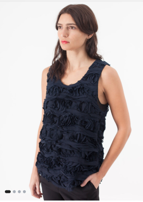
appmaker/shopify-product-image | This block is used to display the product image. |  |
appmaker/shopify-product-data | This block is used to display the product data like title, price, sale price, offer, etc. | |
appmaker/product-counter | This block is used to display or update the quantity of a product. | |
appmaker/shopify-product-variation | This block is used to display the product variations. | |
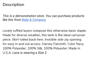
appmaker/shopify-product-description | This block is used to display the product description. |  |
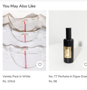
appmaker/shopify-related-product-scroller | This block is used to display the related products. |  |
appmaker/shopify-product-pbp-buttons | This block is used to display the product buttons like add to cart, buy now, etc. |
example page:
Block customization example:
1. Create a new component.
Product Data component (Sample code)
import React from "react";
import { StyleSheet } from "react-native";
import { useProductDetail } from "@appmaker-xyz/shopify";
import { ThemeText, Layout } from "@appmaker-xyz/ui";

const ProductData = ({ attributes }) => {
  const { title, regularPrice, salePercentage, salePrice, productVariant } =
    useProductDetail({ attributes });

  return (
    <Layout>
      <Layout style={styles.mainContainer}>
        <ThemeText size="lg">{title}</ThemeText>
        {salePrice ? (
          <Layout style={styles.priceContainer}>
            <ThemeText
              size="md"
              fontFamily="medium"
              color={regularPrice ? "#fa4545" : "#000"}
            >
              {salePrice}
            </ThemeText>
            <ThemeText fontFamily="medium" style={styles.priceWithOffer}>
              {regularPrice}
            </ThemeText>
            {salePercentage ? (
              <ThemeText
                color="#FFFFFF"
                size="sm"
                style={styles.salePercentage}
              >
                {salePercentage}
              </ThemeText>
            ) : null}
          </Layout>
        ) : (
          <ThemeText fontFamily="medium" style={styles.price}>
            {regularPrice}
          </ThemeText>
        )}
        <ThemeText style={styles.taxIncluded} size="sm">
          Tax included
        </ThemeText>
        <ThemeText
          size="sm"
          style={styles.skuText}
        >{`SKU: ${productVariant?.sku}`}</ThemeText>
      </Layout>
    </Layout>
  );
};

const styles = StyleSheet.create({
  mainContainer: {
    width: "100%",
    backgroundColor: "#ffffff",
    padding: 12,
  },
  priceWithOffer: {
    marginStart: 10,
    textDecorationLine: "line-through",
    textDecorationStyle: "solid",
  },
  salePercentage: {
    marginStart: 10,
    backgroundColor: "#FF0000",
    padding: 4,
  },
  price: {
    marginTop: 10,
  },
  priceContainer: {
    flexDirection: "row",
    alignItems: "center",
    marginTop: 10,
  },
  taxIncluded: {
    marginTop: 10,
  },
  skuText: {
    color: "#888888",
    marginTop: 10,
  },
  sizeGuideIconContainer: {
    marginTop: 10,
    flexDirection: "row",
  },
  sizeGuideIcon: {
    width: 25,
    height: 25,
  },
});

export default ProductData;
Note: You can use the
useProductDetailhook to get the product data. The hook is available in the@appmaker-xyz/shopifypackage. Refer to the useProductListItem documentation for more details.
2. Register the newly created block
Register Block (Sample Code)
Register this block to appmaker blocks registry in blocks/index.js file.
import ProductData from "../components/ProductData";

const blocks = {
  {
    name: 'appmaker/shopify-product-data',
    View: ProductData,
  },
};

export { blocks };
3. Add / Override the block to a page
Add to page (Sample Code)
Add the block to a page by adding the block name to the page's blocks array.
const page = {
  name: "Product Detail",
  blocks: [
    {
      name: "appmaker/shopify-product-data",
      attributes: {},
    },
  ],
};